
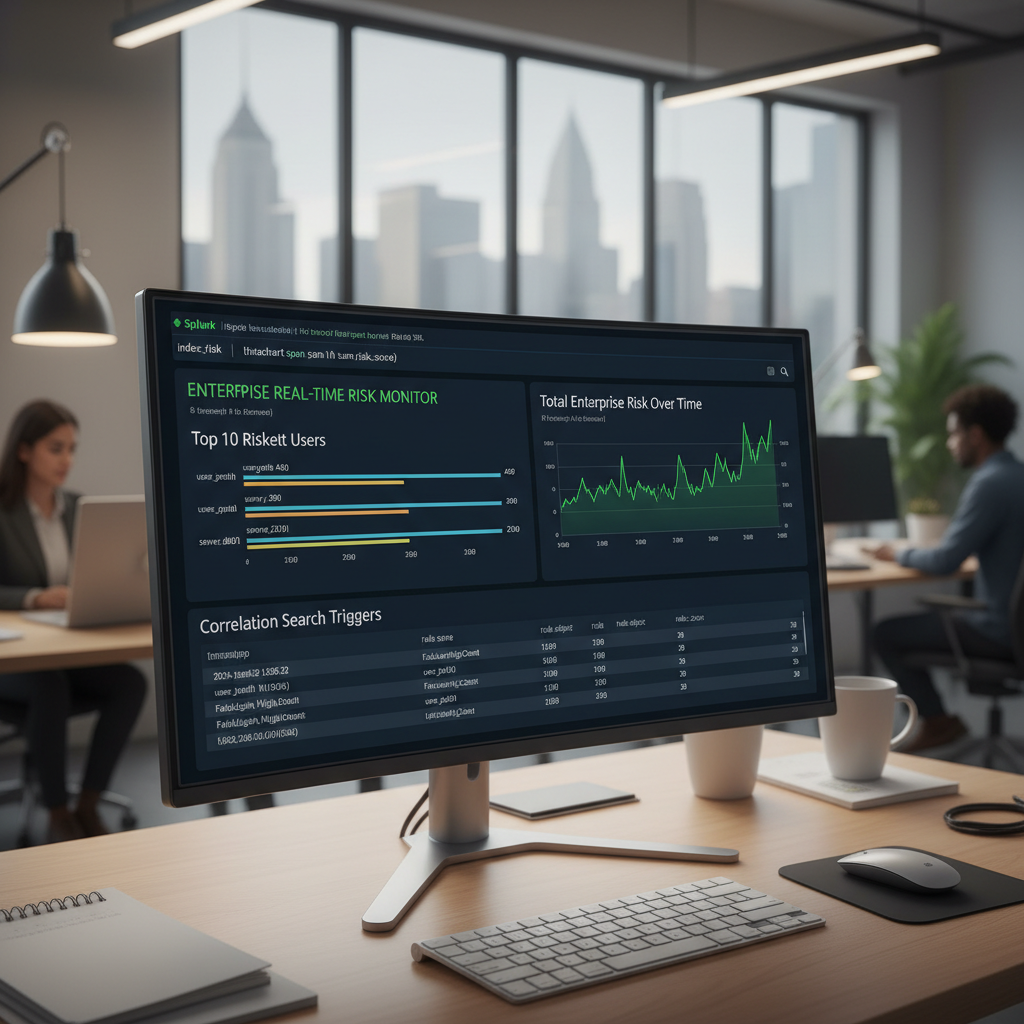
A real-time risk dashboard visualizes live threat data by translating raw security logs into dynamic risk scores. Security engineers build this pipeline to provide Security Operations Center (SOC) analysts with instant, actionable intelligence. Mastering this process directly supports the continuous monitoring and automation objectives outlined in the Ultimate Guide to CompTIA SecurityX (CAS-005).
Step 1: Collect and Normalize Log Data
Before you can build a dashboard, Splunk needs data. You gather data using Universal Forwarders. A Universal Forwarder is a small, lightweight software agent you install on your servers or firewalls. It reads raw logs and forwards them to your central Splunk server (the Indexer).
Once the data arrives, you must normalize it. Normalization acts like a universal translator. It takes different log formats (like a Cisco firewall log and a Windows server log) and forces them to use the exact same field names using the Common Information Model (CIM).
- Log into your Splunk Web Interface.
- Click the Apps gear icon on the left side of the home screen.
- Click Browse more apps and search for the add-on that matches your data source (e.g., “Splunk Add-on for Microsoft Windows”).
- Click Install. This add-on automatically applies the CIM to your incoming logs, ensuring a Windows IP address and a firewall IP address both show up as
src_ip(source IP).
Step 2: Assign Risk Scores to Suspicious Activity
Next, you tell Splunk what malicious behavior looks like by building a Correlation Search. A correlation search is an automated rule that constantly scans your normalized logs for danger.
Instead of generating a noisy alert every time a rule triggers, you configure the rule to apply a “risk modifier.” A risk modifier adds a specific number of points to a user or computer (the risk object). Splunk stores all these points in a special database folder called the risk index.
- Open the Splunk Enterprise Security app.
- Navigate to Configure > Content > Content Management.
- Click Create New Content and select Correlation Search.
- Write a rule (e.g., detect five failed logins in one minute).
- Scroll down to Adaptive Response Actions and click Add New Response Action.
- Select Risk Analysis.
- Assign a score (e.g.,
20) and attach it to the user account that triggered the rule. Save the search.
Step 3: Write the Search Processing Language (SPL)
Search Processing Language (SPL) is the command-line code you use to ask Splunk questions about your data. You write SPL to pull the risk points out of the risk index and prepare them for your dashboard.
Open the Search & Reporting app and type this code into the search bar to find the top 10 riskiest users:
spl
index=risk risk_object_type=user
| stats sum(risk_score) as total_risk by risk_object
| sort - total_risk
| head 10
What this code does, line by line:
index=risk risk_object_type=user: Look inside theriskfolder, but only grab data related to human users (ignore computers).| stats sum(risk_score) as total_risk by risk_object: The pipe (|) takes the previous data and pushes it into a math function. Calculate the total sum of all risk points for each specific user.| sort - total_risk: Sort the list by the highest score to the lowest score (the minus sign means descending order).| head 10: Only display the top 10 results.
Step 4: Construct the Visual Dashboard Canvas
Now, you convert that code into a visual chart.
- In the Search & Reporting app, click Dashboards in the top navigation bar.
- Click Create New Dashboard.
- Name your dashboard “Enterprise Risk Monitor” and click Create.
- Click Add Panel, then select New from Report or Inline Search.
- Paste the exact SPL code from Step 3 into the search box inside the new panel.
- Look at the visualization icons below the search box. Click the Column Chart icon to turn your text data into a bar graph.
Step 5: Automate the Real-Time Refresh Rate
A dashboard is useless during a cyber attack if analysts have to refresh the page manually. You must force the dashboard to pull new data constantly.
- On your dashboard screen, click the Edit button in the top right corner.
- Hover over your newly created bar chart panel and click the Magnifying Glass icon (Edit Search).
- Change the Time Range dropdown to Last 60 minutes. This ensures the chart only shows active, ongoing threats.
- Check the box for Auto-Refresh Delay.
- Type
60sinto the box. This forces the panel to run the SPL code in the background and update the chart every 60 seconds. - Click Apply, then click Save in the top right corner of the dashboard.
Authoritative References
https://docs.splunk.com/Documentation/ES/latest/Admin/Riskscoring
Leave a Reply